Netscape.com Travel Channel: Process Study

In the fall of 2001 our team began the 'Phoenix' redesign of Netscape.com. We had a number of issues to consider including: an impending deluge of Time Warner content, CSS implementation, and the navigation system needed an overhaul.

Each member of the team was given a 'big picture' project to focus on, as well as few specific channels to redesign. I was responsible for sitewide typography and CSS implementation, the Lifestyles Channel, and the Travel Channel.

Before the Redesign

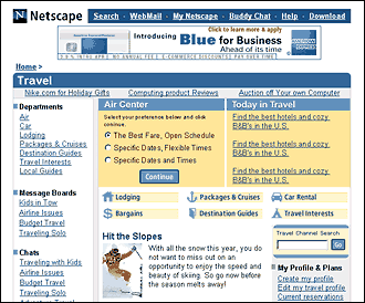
The Travel channel on Netscape.com was already a successful channel in its previous incarnation. A clickthrough analysis conducted by the Programming department showed that the audience was typically quite focused, looking mostly for low-priced air fares through links to Travelocity in the 'Air Center' at the top of the page.

Another thing the clickthrough study found was that our audience had no aversion scrolling, as one of the top 10 links on the page, 'Air Deals', was clear at the bottom of the page.

While this removed some of the pressure to have everything 'above the fold', page position still played a role in influencing clickthrough. The 'Today in Travel' section was in the top 10, contrary to the trend on this page away from editorial content.

Wireframes

Wireframe versions of the channels were created by the producers, these by Kristina Dupuis. It reflects the over-riding vision of this redesign: that the site would become more content-focused and 'magazine-like'. In an effort to keep traffic on our own site (increasing page views and ad revenue), editorial content was given the most favorable position at the top of the page.

The 1st wireframe generated a lot of discussion, but fortunately in the end a more user-centered approach won out with the 'air widget' at the top of the page and editorial content below.

Final Design

In the end, more functionality was added to the 'air widget', which allowed us to reduce the number of steps in the 'fare-finding' process. Editorial content, though below the fold, would be augmented with larger photographs to compel the audience to scroll.

There were several people on the 'Phoenix' team, including Laura Rodil, who art directed me on this page; Paul Pangrazzi, UI design and sitewide navigation; Richard Kramer, sitewide editorial design; and Brandon Wightsel, sitewide photo and image treatments.

Click the image to view full-size version.