Click the image to download/view a .pdf.
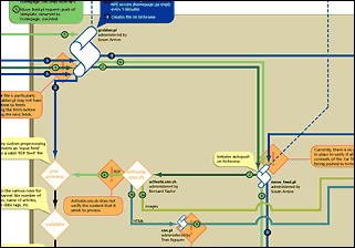
This diagram illustrates how 'live feed' information gets from our outside partners (in this case, Tibco for stock information, and CNN for news) to the Netscape.com home page.
Using a pre-existing visual language for similar diagrams, the research phase proved to be the most challenging aspect of the project. Live feed information, at the time, traveled through at least 3 different buildings, 4 different groups, and a dozen people. Until this diagram was drawn, there was no single repository for all the information it represents.
Download/view a .pdf in a separate window.